Showing posts with label Design. Show all posts

Thursday, May 9, 2013

Designing The Perfect Front Porch for Curb Appeal


Ever arrive at a friend’s home and say to yourself, “Self this home look so pretty”? Well that ladies and gentlemen lends to the perfect front porch, slash entry depending on the type of property you reside in and call home.


Thursday, April 11, 2013

How to Design a Party Invitation


Everyone loves a good party, right?!?! To build the anticipation of great party, whether it is a small get together or a huge soiree, it starts with the invitation. Invitations these days tend to be a text, email, or Facebook® invite. All too often in today’s world of technology we lose the personal touch of traditions from the past, this is why a mailed invitation can be an attention grabber for your next par-tay, as no one expects such a gesture!

For the purposes of this How-To post, I’ll share with you all an invite I recently did for a dinner party in honor Habitat for Humanity Walton County in conjunction with Destin Charity Wine Auction Foundation— Both great local charities serving our local communities!

First set the tone for your party and let it inspire your invitation. This is a Patron Winner dinner party set in Ruskin Place in Seaside, Florida hosted by the owners of Art of Simple . So I went and saw first hand the setting for the party.

Looking at the surroundings and the purpose of the party I pulled:

  • Supplies that feature natural textures and neutral colors for my base.
  • Wine being highlighted I choose to pull a wonderful red that was inspired by both the wine and the Tolix chairs in park.

I designed the invitations using a typeface called “Love Potion”.  I took all of the information that needed to appear on the invite and organized it in an easy to follow manner with emphasis on hierarchy. With such a large amount of information a picture or illustration of sorts did not make sense to me for this particular design, so I took inspiration from the theme of the wine auction and organized it all to follow the shape of a wine bottle.

While the design of the information on the page is important, a simple combination of fonts can make for a really simple and elegant invite. Stick to a maximum of two typefaces, such as a script font for your main headings and a san serif for the bulk of the information.

Supplies I used:

·      Inkjet Linen Fabric Paper *
·      Chip Board {Paper Source}
·      Cream Labels {Paper Source}
·      Chocolate #10 Envelopes {Paper Source}
·      Spray Mount {Michaels}
·      Paper Trimmer
·      Ruler


After I designed the invitation on screen I printed them out and cut them down to size with a paper trimmer. I cut them down slightly smaller than I cut down my chipboard to allow the chipboard to “frame” the invitation. While you do not have to do this step, it really adds dimension and weight to your invitations. So if you are using a thinner paper for your invitations I highly recommend adding it to another sheet of another paper— the backing paper can be another color or texture.

Once everything is cut down to size you’ll want to use spray adhesive to put them sheets together. I recommend doing this outside and laying down a towel to place your invites on, not only to protect them but also to protect the surface below from getting gunky from the spray mount.

After your spray mount has dried you are ready to insert them in your envelopes and address!

I forgot to mention before you go through all of the effort to assemble your invites, make sure you proof read them, your spouse proof reads them, and even some random stranger proof reads them. After all was said and done these invites had 4 typos in them and I had to recreate them all over again. So lesson learned, even though those whom charged you with the task of creating an invite might say they look great have someone besides yourself take a hard look at them for errors!

*This Linen Paper used to be carried by Paper Source and YES you could run it through your printer at home. Sadly I cannot find this great product any longer. I used what was the last of my stock from a personal project for these invites.


Tuesday, September 18, 2012

#401


I moved!

Only one month away from celebrating my One-Year Anniversary of living in Seattle, I packed my bags and relocated to an apartment that was next door to my original home.

I moved to Seattle from Portland (after crazy move from San Francisco a year earlier) in a whirlwind. About two weeks to be exact. Well, two weeks to work in my previous job and then Saturday through Monday to move and start my new job.

I found my former place online, had my brother and sister check it out, then I personally looked at it only a few days before I would officially move North.

My old apartment was such a wonderful place to live and Megan, my old roommate, welcomed me in and introduced me to some amazing people... including my new roommate!

The timing and choosing to move again... next door... could only be described as a "God thing." One girl was packing up her life to travel the globe, another girl was wanting to move out of her home into an apartment, and a few other girls were wanting to get an apartment of their own. The opportunity arose to move next door and the timing couldn't have been more perfect.

I am so excited by this move and even more excited about what year two in Seattle will bring.

(Especially since I finally have a place that will hold my farm table. Dinner parties? Come over, I can seat 12!)

Tuesday, April 17, 2012

Things to: Eat, Drink, Do


Things to do...
Places to eat...
Places to drink...

Instead of keeping a list of must try's in my head, and probably forgetting once I actually have time to do something, I put together three mason jars that have my favorite spots (or things to do) as well as a new places to try. I compiled a list based off of current places I love, Eater updates, recommendations, and yelp...and then keep adding to it!

Care to join me for a night out?

Friday, March 9, 2012

While the roommate is out...

After living in Seattle for four months, I decided to get more comfortable and expand my sense of home to outside of just my bedroom.

This meant taking over a wall.

I have been hesitant in the past because Megan, my flat mate, and I have different styles. She is more traditional and feminine (read: loves pink) and I am more modern eclectic (read: quirky).

I gave her a little bit of warning and then while she was out on a day date, I went for it.


The post it notes are items that are changing... either coming from PDX or from one of my compulsive shopping trips.

I still need to find a place to put up my favorite photographs of my college roommate / ho cho. They used to be above my ridiculously awesome refurbished turquoise kitchen table in SF... apparently it was creepy. Disagree!

Wednesday, January 25, 2012

Mantras


I am in love with this book by Megan Clark of Hi, Friend Designs. It will be the perfect compliment to my coffee table and extra bit of whimsy I may need on a down day. You can get your own copy on Blurb!

Thursday, May 19, 2011

Big Ben

I fell upon Flud watches late one evening this week. I couldn't sleep and after bouncing throughout google, I landed on a gold mine.


Picture_42

These watches are considered unisex but I find them to be a bit too masculine for my taste. However, Flud's design and colors are intriguing and I can't help but love the Big Ben series in the Oak style.


Picture_40


Picture_41

In case you love it too, Amazon.com has it!


http://rcm.amazon.com/e/cm?lt1=_blank&bc1=FFFFFF&IS2=1&npa=1&bg1=FFFFFF&fc1=000000&lc1=C9057D&t=peloanbu-20&o=1&p=8&l=as1&m=amazon&f=ifr&ref=qf_sp_asin_til&asins=B004D4QUYY

Tuesday, May 3, 2011

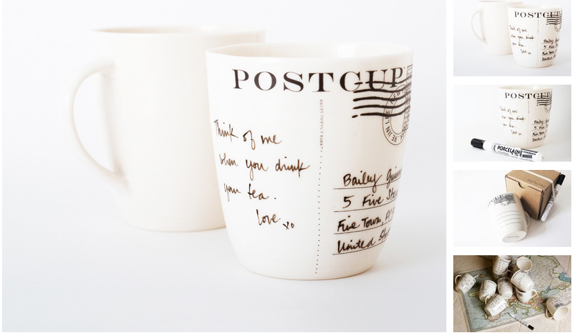
Think of me when you drink this cup


Picture_14

If you happen to be wondering what would be a fantastic gift for yours truly... look no further! This postcard cup by Bailey Doesn't Bark is personable and a keep sake. Practice your handwriting, write a quick note, bake then give!


[vimeo http://www.vimeo.com/16157079 w=400&h=225]


The postcard mug. Apply your own message to our take on the postcard.


- 14 oz (0.4 L) capacity 
- 4in (10cm) height x 3.5in (9cm) diameter 
- Natural color of the clay, slightly ivory white
- Microwave safe, hand wash recommended
- Handmade in USA, {watch how}
- Pen included, black


Instructions: Clean Postcup™ with soap and water or wipe with lint free cloth and alcohol. Apply message or art with Pebeo porcelain pen. Allow to dry for 24 hrs after application then bake in oven for 35 minutes at 300℉ (150℃). Porcelain paint will set permanently once baked. Avoid abrasives when washing. You may erase the paint prior to baking using rubbing alcohol


$52.00


Find here>>


D

Share

LinkWithin

Related Posts Plugin for WordPress, Blogger...